01 · Bean
Gold core held inside a deep rim. The most contained of the six — good inside a card.
meet your coach
jane
pak
typography & design elements
Type, spacing, and alignment are the main focus in this visual brand. The fonts give an elevated, clean presentation while the alignment creates interest.
elegance · clarity · openness
01 · type
two fonts,
seven ways
Fraunces carries the voice and announces— headlines, the wordmark, pull-quotes. It's an old-style serif with two variable axes doing brand work: WONK swaps in alternate letterforms that sit slightly off-kilter, and SOFT rounds the terminals. Wonk on, soft up: warm, and a little crooked on purpose. Classic, but outside the box.
Inter stays out of the way — body copy, labels, buttons, captions. It's a neutral workhorse with no personality of its own, which is the point. Only Fraunces gets to have an opinion.
stop auditioning
find the belief underneath
the excavation
root-cause work for high-achieving women.
we go beneath the pattern to the thing installing it.
the excavation
jane pak · iki advisors
the italic rule
Italic on the verb, roman on the completion. This signature move creates distinction and opportunites to emphasise and it repeats everywhere including the wordmark.
max-width on the text element, never the container.02 · hanging
orderly, but
not in line
Every H1 is a hanging paragraph. So is every H2, and every body paragraph. First line flush, everything after it hangs. The block keeps a hard left edge — it just isn't where you expect it.
At 62ch the eye needs a reset point per paragraph, and the hang provides one without a blank line. It is the layout doing the same job the italic rule does in type: hold the classical thing, break it in exactly one place.
Headings use an em-based indent so it scales with the type. Body uses 40px, dropping to 20px on mobile.
/* headings — em-based, scales with type size */
.h1 { text-indent:-.14em; padding-left:.14em; }
.h2 { text-indent:-.12em; padding-left:.12em; }

/* body — fixed, first line flush */
.hang p { text-indent:-40px; padding-left:40px; }
.hang p:first-child { text-indent:0; padding-left:0; }
@media (max-width:640px){ .hang p { text-indent:-20px; padding-left:20px; } }
Indent headings in em, never px — a 40px hang is invisible at 288px and enormous at 42px.
03 · color
neutral
colors first
the base
Ground
#F6F3F2
Panel
#FFFFFF
Taupe
#CEBBB6
Slate
#6A5C58
Charcoal
#2C2530
the warm · shapes and motion only
Gold
#CE7E2E
Copper
#B65C28
Clay
#9D3D2E
Wine
#5D1430
04 · photography
presence over
performance
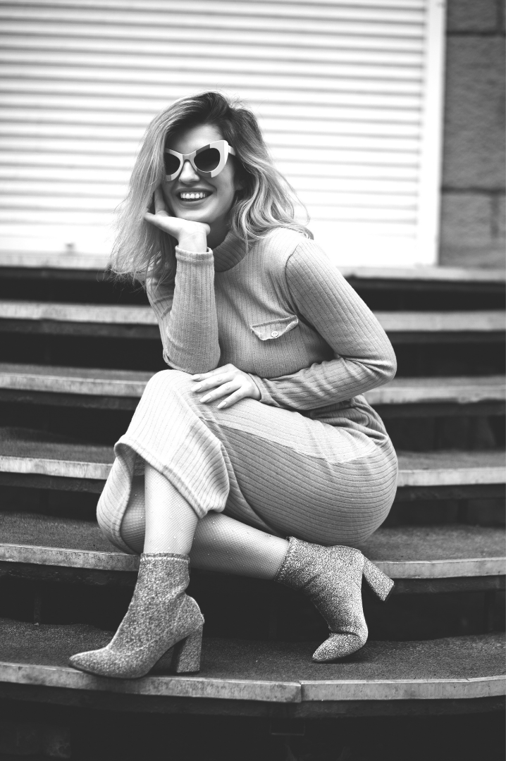
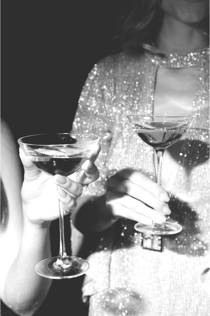
With no illustration and no icon set, photography carries the warmth this system does not get from colour. It is the highest-leverage asset in the identity and the only part a competitor cannot copy.

framing
05 · buttons
three
levels
Committed actions — apply, buy, enroll. Hovers to wine.
Lower commitment — join the list, get the replay. May repeat.
Ends a narrative section. Never inside a card or form.
06 · shapes
the fire
within you
These shapes are the fire within, still burning and sharing their light. They represent the unshakable light that can never be put out, and that even the smallest amount of energy is the beginning of change.
They are hand-painted and unique - irregular and unrepeatable, with no two being alike. This work does not hand anyone a template for who to be.
They also read as range and potential on display as they use real light and breadth of chroma. This shows change possible and Jane's capacity to work with a range of personalities and issues - and you can truly come as your own distinct color.
Every stage of development is here, and none of it is too hot to handle — even embers have power, and every person is capable of going from a barely lit wick to a firestorm.
Gold core held inside a deep rim. The most contained of the six — good inside a card.
Gold sweeping the right edge, plum weighting the upper left. Light from behind and below.
Broad gold body, tight dark rim all the way around. The most solid of the set.
Gold arc curling over a deep hollow. The hero shape — strongest at large scale.
Two lobes, gold pooling low and right. The most irregular silhouette — hardest to read as generated.
Long and low, gold running the upper edge. Best cropped wide for section breaks and email headers.
07 · motion background
quiet
or not at all
A fullscreen fragment shader in raw WebGL — no library, about 3 KB. Wine ridges on ground, moving slowly enough that you notice only if you stop and look. Same idea as the shapes: something still moving under a calm surface.
live · same settings as the hero
uniforms
  u_amp    0.130
  u_scale  3.2
  u_sharp  1.6
  u_warp   0.45
  u_width  1.00
  u_ground #F6F3F2
  u_ink    #5D1430

js
  speed    0.16